Pastels Activity Log

November 27, 2009

During this drawing I believe I got worse at drawing. This was a very challenging project because using pastels was very complicating for me. I did not find any part of this project to be easy. I made several mistakes and I had to start over once. Overall, during this drawing I did not find any improvements other than my tracing.

            This project was extremely difficult for me because I have never used pastels before. When I was using the pastels I made many mistakes with it. First off, I used the wrong skin color, hair color, and lip shade. My first drawing was a disaster. However, my second drawing was an improvement. I did find the right skin color and for the hair color I blended gold and white and it came out perfect. Unfortunately, I could not find the correct lip shade. The most disappointment thing about this drawing was that the picture came out looking nothing like Hayden Panettiere. This was disappointing for me because I turned something beautiful into something horrible.

            This project was not just a disaster. Tracing the picture of Hayden Panettiere was fun. I also liked blending the colors to make a good shade of blonde for her hair. I also liked the fact how we got the chance to draw a portrait of a Hollywood star.

Although there were more disappointments rather than improvements I did learn how to use a new form of drawing, which was the use of pastels. Also I did have fun using the pastels even though the outcome wasn’t so great. The most fun part for me was getting the chance to draw a portrait of the amazing Hayden Panettiere. In conclusion, the most important part was the Mr. Nelson had taught us a new way to draw.

Watercolor Still Life

November 21, 2009

During this watercolor activity I believe that I have improved on several things. Not only did I improve on certain aspects I learned many new things about the color wheel. I learned about primary colors, secondary colors and much more. With my new knowledge on the color wheel I figured out how to mix specific colors to make a new color. I also learned how to use a watercolor pencil. I applied all of these new aspects of coloring and used them to make my watercolor still life.

During this watercolor still life I found some things rather difficult and other things more fun. Some of the difficult parts of this drawing was tracing the image off of our tablets. It was hard to trace it off my tablet because I never had the chance to trace in the dark so I could not see the image thoroughly. The other hard part was trying to re-trace the image back on to the watercolor paper. The two hardest parts for me was during the actual painting. It was hard for me to find the right size of a paintbrush to make the painting looked too good. I would either get too big of a brush or too small of a brush. Lastly, it was hard for me to use the right amount of water. This was hard for me because if I used too much water, the water would start running of the page and begin to blend with other colors and eventually ruin my painting.

Other than thee challenges I found this painting rather fun. It was fun to use to watercolor pencils and to mix colors. In conclusion, I believe I had improved greatly on this drawing compared to my first still life in the beginning of the year.

Color Wheel

November 9, 2009

Color Wheel

Watercolor Resource Post

November 7, 2009

William Blake

Artist: William Blake

Title: The Angel of the Revelation

Dimension: 15 7/16 x 10 ¼ in

 Media of each work: Watercolor, brush and gray wash, pen and black ink over graphite on paper

Why you chose it: I thought this was a very beautiful and unique drawing. I thought this was a beautiful drawing because of how big the human is in the middle compared to other people in the background. I also loved how he used bright and dark colors to paint this drawing.

What about the reference image you can integrate: I really like the scale William Blake used to show how big the male was compared to the other humans in the drawing. He also did a very good job using bright colors to show how powerful and strong the male is in the center of the drawing.

Some interesting factoid about the artist(s).  William Blake was not only an artist, he was also an English poet. He published many books and within those books he had his own illustrated drawings.

____________

 Edward Hopper


Artist: Edward Hopper

Title: The Mansard Roof

Dimension: 13 ¾ x 19 in

 Media of each work: Watercolor on paper

Why you chose it: I think this is an amazing painting because he used beautiful colors. He used a beautiful green to paint the plants around the house and a pearl white to paint the house itself. Mainly, I chose this drawing because he drew a beautiful house.

What about the reference image you can integrate: I really liked the colors he chose to paint this drawing. Most importantly, he showed a great example of 2-point perspective. He showed this by drawing the two sides of the house.

Some interesting factoid about the artist(s). Edward Hopper was born in Nyack, New York. He learned how to draw in local school before he looked for help and received instruction from commercial art in New York in 1899.

 ____________

Paul Cezanne

Artist: Paul Cezanne

Title: Still Life with Watermelon and Pomegranate

Dimension: 12 x 18 ½ in

 Media of each work: Watercolor and pencil on paper

Why you chose it: I chose this drawing because it reminded me of our still life activity in Fine Arts class. I though the still life drawing was one of my worst drawings, so I like to see what a successful and beautiful still life drawing looks like.

What about the reference image you can integrate: I really liked dark colors he used. I also liked the background colors he used as well. He also used very good scale and good shapes.

Some interesting factoid about the artist(s). Paul Cezanne was born on January 19th, 1839 in Aix-en-Provence, France. He failed in law school and then spent the rest of his life painting. He was a very friendly man and easy to get along with and he was very good friends with many famous painters.


2-Point Perspective Activity Log

November 3, 2009

Day 1     Day 2     Day 3     Day 4

Day 5

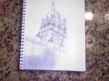
            During this drawing I believe that I have learned many new things. While I was learning new terms I also realized that I needed to improve in certain parts of this drawing. Not only did I need to improve, I also did very well in certain parts of the drawing. Overall, I learned several new terms, discovered what I needed to improve on, and also discovered what I did well in this drawing.

            Since this was a new form of drawing for me I found several things very difficult, rather than easy. However, drawing the back to the vanishing point was rather easy due to the past experience with the 1-point perspective drawing in Brophy Hall. Trying to draw the half circles, the finials on top of the tower, and the shadows were extremely difficult to draw. Above all, attempting to draw every single detail that Brophy Tower had seemed impossible to me.

            Some of the easy aspects this drawing had, other than drawing back to the vanishing points, were drawing the main structure of the Tower. For example, when I had to draw the boxes on top of the boxes to create the structure of the Brophy Tower was easy for me. The shading of the Tower and drawing the trees were probably the easiest part of this drawing.

            Other than my challenges and successes I learned something very important. I learned how to draw in a 2-point perspective. I also learned how to find my vanishing points even if they run of the page. In this drawing my vanishing points ran off the page so I used pieces of my kneadable eraser to mark my vanishing points. In conclusion, I had many challenges and successes in this drawing, but most importantly I now know how to apply 2-point perspective to my future drawings.

2-Point Perspective Resource Post

October 17, 2009

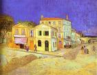
Yellow House in Arle

Artist: Vincent Van Gogh

Title: The Yellow House

Dimension: 72cm x 90cm

 Media of each work: Oil on Canvas

Why you chose it:  I love the style that Van Gogh uses in his paintings. I also love the way he draws the buildings in this picture.

What about the reference image you can integrate:  I really like the use of Van Gogh’s 2-point perspective to draw the sides of the buildings.

Some interesting factoid about the artist(s).  Vincent Van Gogh had a brother named Vincent who unfortunately died at birth.

________________

The Lighthouse at Two Lights

Artist: Edward Hopper

Title: The Lighthouse at Two Lights

Dimension: 74.9 x 109.9cm

 Media of each work: Oil On Canvas

Why you chose it- I chose this picture because this picture is very relaxing. It is a very quit picture. It shows how beautiful the world is and how quiet the world can be.

What about the reference image you can integrate:  Edward Hopper used 2-point perspective to draw the sides of the light house. This helped make the picture look as realistic as possible.

Some interesting factoid about the artist(s).  Edward Hopper was born and raised in Nyack, New York and died in New York City in 1967.

________________

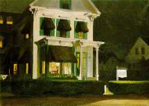
Rooms For Tourists 

Artist: Edward Hopper

Title: Rooms For Tourists

Dimension: 30 x 40in

 Media of each work: Oil On Canvas

Why you chose it- I chose this picture because this picture is very soothing. It’s a quiet painting, as well of the rest of his paintings. I also like this painting because it is a picture of an everyday object that we are used to seeing.

What about the reference image you can integrate:  Edward Hopper used 2-point perspective to draw the sides of the house. Not only did he use it for the sides of the houses, he used it to draw the houses alongside and behind the main house. He used 2-point perspective to really draw the architecture of the houses.

Some interesting factoid about the artist(s).  Edward Hopper was an American artist who grew up in the state of New York. Edward Hopper is well known as a realist painter and a printmaker.

1-Point Perspective Activity Log

October 16, 2009

Day 1Day 2IMG000036


                During this drawing, I truly believe I have improved in several things. I also believe that this was my favorite assignment assigned by Mr. Nelson. The reason for this is because I learned a lot of new things and we got to draw a part of Brophy’s campus. It was also fun to get out of the classroom and draw new things in Brophy Hall.

                The aspects that I believe I improved on were shading, as I did in the last few drawing assignments. I shaded the ceiling, the walls, the doors, the windows, the rug, and the carpet. I also improved on 1-point perspective drawings. I made flat objects in the drawing look as realistic as possible.  I also drew Brophy Hall as exactly as I was looking at it.

                With every drawing assignment comes dislikes. Unfortunately, I had several dislikes in the assignment. It was really frustrating for me to draw everything in a 3D shape. It was really hard to really draw every objects design in great detail. The hardest part about this drawing was the measuring. It was hard to measure the size of everything like the walls, the doors, the windows, and worst of all the picture frames.  

                Most essentially in this drawing I learned new terms. The new term I learned was 1-point perspective. I learned the definitions of 1-point perspective and vanishing points. The vanishing point in your drawing can be determined by your eye sight, or your point of view. Basically, it is the specific angle of which you are looking at the object you wish to draw. Once you have determined the vanishing point you can draw your drawing exactly the way it looks from your specific point of view. In conclusion, I disliked and loved certain parts of this project, but most essentially I learned new ways to draw.

Pen and Ink Drawing

September 24, 2009

  Grid Pattern Day 1 Day 2 Day 3 Day 4

                During this Pen and Ink drawing during class I disliked certain things and liked certain things. First off, I loved using the grid pattern. I loved this because it really helped me focus on one certain area in the drawing instead of focusing on the huge drawing itself. It mostly helped me because there was already a tracing of the drawing before I started to ink. Using the quills was fun as well. But they were not only fun, they were extremely frustrating as well. They were frustrating to me because if you messed up once you messed up the entire drawing. The permanent ink made me feel pressured to not mess up. Above all I didn’t’ like how sometimes the quills would create ink blobs on your drawing and it would possibly ruin your drawing. I also disliked how we had to erase the grid lines even though it made the picture look better. In conclusion, my favorite part was creating the grid lines and tracing the drawing and my most disliked part was how the ink was permanent, so if you messed up there was nothing you could do.

                Not only did I like and dislike parts of this drawing I also learned several things as well. I learned many things about pen and ink drawings itself and many of its techniques. We learned that if you are using permanent ink you can never go straight to drawing, you have to trace it out first just in case you mess up. I also learned how to correctly hold the quill so you can avoid thick lines and ink blobs. The most important feature of this project was not learning how to use quills. It was learning how to cross hatch instead of outlining. I think I did a rather well job of cross hatching the trees and the church, although, I did have a rough time cross hatching the grass. Most essentially, I learned many new techniques on how to cross hatch, use quills, and how to use a grid pattern to help trace out pictures.

1 Point Perspective Resources

September 23, 2009

perspective – The technique artists use to project an illusion of the three-dimensional world onto a two-dimensional surface. Perspective helps to create a sense of depth — of receding space. Fundamental techniques used to achieve perspective are: controlling variation between sizes of depicted subjects, overlapping some of them, and placing those that are on the depicted ground as lower when nearer and higher when deeper. In addition, there are three major types of perspective: aerial perspective, herringbone perspective, and linear perspective.

vanishing point – In linear perspective, a position on a horizon where lines or rays between near and distant places appear to converge (come together). In order to produce an illusion of depth in a two-dimensional representation of space, artists sometimes use one, two, or more vanishing points. Employing this method might seem to contradict a strictly mathematical understanding of space: parallel lines — as might form the edges of a straight path — meet at the vanishing point in a picture of a distant place, even though such lines could not meet in the actual distance. Although an artist marks vanishing points in pictures to determine the directions of receding lines, s/he is apt to remove them before completing a picture, because vanishing points are merely points of reference. Where would a vanishing point be placed in a drawing of this railroad scene?

______________

Resource Post 1

 cafe terrace at night

Artist:  Vincent Van Gogh

Title: Café Terrace At Night

Dimension: 85 x 65.5cm

 Media of each work: Oil on Canvas

Why you chose it: I chose this drawing because I think all of Van Gogh’s paintings are beautiful. I’ve always liked Van Gogh’s paintings due to his use of oil on canvas. I also liked his paintings because he usually draws a majority of his paintings at night time. I like all his night time drawings because I love how he draws the dark blue sky with the white stars. Above all, I think he showed a terrific example of a 1-point perspective.

What about the reference image you can integrate:  He used wonderful colors of dark blue, and yellow. He drew the left side of the drawing beautifully with all of the citizens. He also did a great job drawing the second story of the café. He also drew the ally perfect with the 1-point perspective.

Some interesting factoid about the artist(s).  Vincent Van Gogh lived in Paris with his family and his brother Vincent. Vincent only sold one painting in his entire lifetime, but become a very popular artist when he died. The first painting he drew was of poor people. In the beginning of his art career he drew many sad and dark drawings. In conclusion, Van Gogh lived a very sad life.

_______________


Resource Post 2

St. Luke Drawing the Virgin 


Artist: Rogier van der Weyden

Title:  St. Luke Drawing the Virgin

Dimension: 137.5 x 110.8 cm

 Media of each work: Oil and tempera on panel

Why you chose it: I chose this because it is a very religious drawing. This drawing resembles the beauty of Mary The Virgin holding baby Jesus and Gabriel the angel in the background. I also chose this painting because this drawing looks extremely realistic.

What about the reference image you can integrate: The artist did a wonderful job exemplifying 1-point perspective. He exemplified this by drawing the view of the town/village through the window behind Mary. He also used good patterns drawing the tiles on the floor.

Some interesting factoid about the artist(s).  Roger van der Weyden was born in 1400 and died in 1464. He was also know as Roger de la Pasture. He became a City Painter for the city of Brussels in 1436. He biggest masterpiece was Descent From the Past.

_______________

Resource Post 3

La Rue de La Bavolle at Honfleur 


Artist: Claude Monet

Title: La Rue de La Bavolle at Honfleur

Dimension: 100 x 100cm

 Media of each work: Oil on canvas

Why you chose it: I chose this drawing because I don’t think Claude Monet is very noticed for his beautiful art. This drawing is beautiful in many ways. The way how the sun hits the town in a perfect way to light up the ally and the buildings and especially how the sky is a beautiful blue.

What about the reference image you can integrate: He used the color yellow and orange for most of the drawing. He used it for the street, buildings, and the girls clothing. He also used a form of 1-point perspective by drawing the ally of the town, layering the buildings on top of each other.

Some interesting factoid about the artist(s).  Claude Monet was born in Paris in 1840. He died at the age of 86. As an artist he helped create the type of drawing called Impressionism. He spent most of his life drawing pictures of his teachers. He spent his last 10 years of his life painting his water graden.

Cross Hatching Activity

September 16, 2009

KNIVES CROSS HATCHETCross Hatching/ToasterCross Hatching/Knives